Showing posts with label house. Show all posts

4.03.2012

:: my kitchen ::

my kitchen, finally. i know, it's a bit ridiculous how long it's taken me to share it here. it's been finished for a while now, but we just have been so busy getting ready for our big move. our place sold quickly, and we have bought a new home in victoria, so we are all set to go in about six weeks!
i almost forgot to take any before pictures, so in the two i've got here, we had already removed the backsplash. the tiles were a pukey grey-pink-speckled mess. went SO well with the lovely shade of brown on the wall. i never even had the heart to paint that room, i loathed the kitchen so much i didn't want to expend any energy trying to make it better until we were able to renovate.


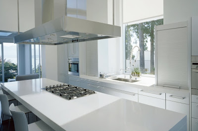
without any further ado, a few pics of our little kitchen, along with a few notes at the end about the materials we used. i hope you like it!


my husband painstakingly scraped the popcorn coating off the ceiling, then patched and painted the drywall. i am so glad he did, it made a world of difference. we installed lots of potlights, and i love how bright it is. we also extended the cabinets to the ceiling, it's a no-brainer, but makes a world of difference for storage.


we didn't replace our appliances, as we had bought new ones when we moved in just over three years ago. we changed the layout only a tiny bit, moving the range out a little from the corner to accommodate a half-moon pullout system {love!!} and removing the short peninsula that had been where the bank of drawers is now. it opened the kitchen up perfectly, it felt so cramped before.


we also added the cabinetry and workspace along the left in the photo above. that wall was bare before, and it made much more sense to include some cabinets and a pantry unit there for extra storage, and a perfect space for me to work.


i think it turned out really well. it certainly isn't my dream kitchen, but the finishes are ones we love, and we definitely learned a lot along the way. we didn't want to do anything in the way of moving fixtures or walls, and so we worked essentially with the space the way it was. that being said, we absolutely love our new kitchen, it is light + bright + modern, and totally "us". i am also happy that my beloved eames shell chairs fit right in, they looked a little out of place in our old ugly kitchen!

cabinets :: ikea, with applad white fronts {white flat-panel cabinets are our favourite, and they fit the budget!}, along with some horizontal aluminum-framed glass cabinets.

countertops :: eco by cosentino, in crystal ash. we really liked the eco aspect, definitely tried to incorporate some earth-friendly choices in our kitchen. we opted for a modern-style 3/4" profile with flat edges. i love them, probably my favourite part of the kitchen.

backsplash :: pale aqua glass 2"x6" narrow subway tiles. we opted for a stacked installation, i like the more modern look of the vertical lines.

flooring :: forbo marmoleum plank, in volcanic ash. i adore this floor! it is warm and forgiving to stand on, comfortable underfoot, and it looks great. we chose the click, which is a floating floor system, and the seams are so tight you can barely see them. a word to the wise, the floors do scratch a little, but i find that it just melds into the pattern and creates a bit of a patina. overall, i love it.

workspace surface :: 3/4" natural bamboo ply by plyboo. love. love. warms up the kitchen really nicely, and is a wonderful surface to work on. it's a bit soft, so i wouldn't necessarily recommend it for use as a prep surface in the kitchen.

pendant light :: brushed nickel fresnel lens pendant fixture by progress lighting. i am in love with this light. it brings the right amount of industrial edge, but is still modern and polished-looking. it also has the most clever hinge-style access to change the bulb. it's the little things! i ordered mine through home depot, and it was a lot less expensive than it is on the progress site!

that's about it, i guess! thanks for taking a tour of my kitchen with me, hope you liked it.

8.24.2011

kitchen -- still!

why, yes. this will go down as the longest-short-kitchen-renovation ever. here we are nearing the end of august, and we are finally seeing the light at the end of the long, long tunnel. this past weekend, i finally stole a bit of time and painted the powder room and my workspace wall. i am in love with the colour, a cool + calming pale grey. the name makes me laugh, 'heavy goose' by none other than martha, because who else would call a paint colour 'heavy goose'? it looks fabulous next to my gorgeous bamboo work surface. here's a little peek!


the paint colour doesn't show up too well in the photo, but it was getting dark. anyhow, i'm so happy to be making a bit more progress. we finally got our floors put in last month, and i adore them. we chose a dark grey marmoleum plank, and it feels so soft and warm underfoot, it's perfect. the rest of this reno is all up to us, so there's no telling when it may get done, as we are both super busy. so wish us luck as we paint, tile, paint, and tile some more!
hopefully i'll be showing you some final photos in the next month or so, though if i were you, i wouldn't hold my breath ;)

8.15.2011

sitting on a cloud


all images via cb2

i thought i'd share some new offerings from cb2 that caught my eye. i especially love the look of the cloud 16 lounge chair {bottom}. i'd love to have one in my living room to replace the leather slipper chairs that we've currently got, which i feel are just too weighty and chunky now for the look i'd like in that room.

8.13.2011

fall fresh


all images via west elm

i feel as though we've barely had summer here in vancouver, the weather has been less-than-desirable for our fairest season. the chill in the air each evening has me thinking of fall, so i though i'd do a little shopping. west elm always has really lovely seasonal selections, i like the ocean hues here, juxtaposed with the warmth of wood and textiles.

4.08.2011

out with the old.

warning :: the pictures you are about to see might hurt your eyes.


and here it is. our old kitchen, in all it's glory. it's hard to see, but the cupboards are old, dingy white melamine with that curved oak edge trim. who ever thought that looked good, anyhow? the pulls are semi-circle white plastic, again, really special.
on the left, the wall is painted a lovely shade of brown that i have dubbed 'baby poo brown'. on the right [where my workspace was], a putrid shade of butter yellow. on the ceiling, there was a layer of old, dusty popcorn stucco. the floors were white 80's lino with a mauve and teal geometric pattern. it was all topped off with the crowning jewels, two old ivory track lights. not the nice kind.


this kitchen has slowly been sucking the life out of me since we moved in over 2-1/2 years ago. i am so, so excited to be getting rid of it, i can barely contain myself! we aren't moving any walls, and we'll be keeping our appliances [which are fairly new], but i know the change will be a big one. i cannot wait.


derek did 90% of the removal work, with me occupying the kids, running around to many different hardware stores {multiple times}, and providing help when he needed. it all culminated with the floor removal yesterday afternoon. the end of a really ugly era.


we are now left with a pretty blank slate. the electrician is on his way right now, and the cabinets are being installed monday. the rest will trickle in over the next month or so. countertops have been ordered, backsplash chosen, and light fixtures are on their way! the floors are nearly there. we're having a hard time with that last one, but i think we may have just found the right floor last night!

i'll be back next week with some cabinet sneak peeks, but the final reveal will have to wait until everything is in place. thanks for joining me on this ride!

3.01.2011

airey indeed.

pardon the tongue-in-cheek title to my post, but this vancouver residence by local firm airey homes is like a breath of fresh air. with the open space flooded by light from the many tall windows, this contemporary home is a pleasing juxtaposition of cold + warmth. the polished concrete floor and unfinished concrete walls are brightened by warm natural wood + a crisp white kitchen. there is a definite long, linear feel to the furnishings and fixtures. the low profile sofa and extra-long dining table add to the feeling of space. nothing is crowded, nothing is cluttered.


of course i had to share the stairs. you all know how much i love a great set of stairs, and these concrete steps does not disappoint. the open risers add to the airiness of the space by allowing the eye to be drawn up to the second level.
speaking of, i'd love to have seen some pics of the bedrooms in this house, i can only imagine they would be just as stunning. you can find the rest of the photos on the airey group website under projects, private residences, drummond drive.

all images via the airey group

:: edit, march 3 2011 ::

with big thanks to gaile guevara, i can provide a little more info about this amazing home! gaile worked on the interiors of drummond drive, alongside interior designer donna toppings. together, these talented ladies created an inspiring + gorgeous interior, including those smashing cantilevered concrete stairs. great work, ladies.
ps - you can see more pictures of this home on gaile's site, right here. thanks, gaile!

2.23.2011

bowen island escape.


one of my favourite things to do online is to browse architects' portfolios, particularly local ones. i find it so inspiring, and love reinforcing the styles i am drawn to and what i'd like to strive for in my own home.
i fell head over heels for this bowen island residence, by west vancouver firm burgers architecture inc. the open, airy space is kept streamlined + simple with white walls, natural wood plank vaulted ceilings, and concrete floors. built on an ocean bluff with amazing 180 degree views, it just seems to fit perfectly in its' surroundings of rock, trees, and cliffs. also notable is the use of geothermal heating and a 10000 gallon rain cistern, which make this home not only stunning, but kind to our earth. love.


the sightlines in this home are my absolute favourite. i am a total sucker for a good sightline. look at the expanse of smooth concrete, juxtaposed with the perfectly angled beams in the ceiling. the trees seem to to float at the end of a tunnel in the photo above.


all images are from burgers architecture inc.

2.15.2011

sleek + warm, LAXseries furniture


i am completely over the moon for this beautiful LAXseries furniture coming from santa monica design firm MASHstudios. with a focus on quality, sustainability, and responsible manufacturing, the LAXseries is built to last. using high-grade materials, recyclable aluminum, low-voc + natural oil finishes, this furniture is made to last a lifetime while leaving the smallest footprint possible.
looking beyond the environmentally responsible production, these pieces have style to spare. i love the warmth of the natural english walnut paired with crisp white powder-coated aluminum. minimal styling, modern sensibility, it's picture perfect.


i think my favourite is the platform bed, above. i'd like to climb right in. oh, and that room is pretty fantastic, too. love that exposed concrete wall. pure bliss.

all images via LAXseries.com

2.10.2011

lemon + teal for the home.


images via shops as listed below, clockwise from bottom left.

it was another picture perfect sunny {but cold!} day in vancouver today. this is just the kind of winter weather that i love, and is quite typical of vancouver in february. and then my spirits are usually smashed by a wet + soggy + grey month of march. sigh.
anyhow, i thought i'd share my lemon + teal finds for the home today. so much goodness out there, i must say it was hard narrowing it down. when i do roundups like this, i find i often feel the urge to redecorate and rethink all my accent colours! how about you?

turquoise moroccan pouf :: the cross decor & design
facet cream/citrine rug :: dwell studio

:: also make sure to have a look at these sweet mugs that molly of charlotte's fancy posted about last week. we always seem to be on the same wavelength, and those mugs would fit perfectly in this post ::

1.12.2011

let there be light


gorgeous, light-filled, minimal living. while it is doubtful i could live in a space like this [i have two kids, and a lot of stuff], i sure do love looking at it. this london apartment is a recent addition to the locations being showcased on shootfactory, a uk site for film + tv rentals. loads of eye-candy there, it's one of my fave places to browse when i find myself with a spare moment.


and those stunning greystone eames chairs? a very very close runner up in colour to these beauties, which we just recently received, and love very very much.

10.06.2010

heath ceramics :: backsplash inspiration

my head is spinning with images of tiles + countertops + faucets + hardware + flooring. oh, my. as always, there are loads of amazing designs over at heath ceramics. such beautiful tile. i will have to keep dreaming, but i can certainly take my cue from the inspiration, right?


and, i know it's not a kitchen, but i love this palette + tile layout. sublime.

all images via heath ceramics. individual architect + photographer credits in the gallery.

8.12.2010

crisp + cool

image via dreaming green

i love the contemporary modern look of this bathroom. the wood gives it a lovely warmth, in contrast with the sharp linear style of the room as a whole. i also love the ice blue hand towels paired with everyday whites. crisp + cool.
this gorgeous space is found in an eco-friendly townhouse featured in the book dreaming green. i happened upon this book while i was in a local shop the other day, but only had a moment to flip through it. i was intrigued, so looked it up when i got home later on. looks like there would be lots of inspiring stuff inside!

8.11.2010

dreaming big

i'm totally in love with this summer house, featured in the august 2010 issue of style at home. the expansive views of forest + lake are pretty much to die for. as are the open stairwell, modern furnishings, amazing kitchen, and sleek master bed + bath. yup, i love it all.

images via style at home, august 2010

the folks at style at home also shared this fantastic kitchen in the september issue. i love the mix of dark + light grey with white, brightened with bold pops of orange. i also love that this is a budget-friendly, ikea-based kitchen! huge inspiration for me as we get set to reno our kitchen [ikea styles] this fall.


image via style at home, september 2010